A new & improved online booking process.
A personal project for Fresh Tilled Soil's AUX bootcamp presentation.
The Solution:
A simple, straightforward user experience that empowers budget travelers by allowing them to decrease the cost of their base ticket price.
The Challenge:
Improve the online booking process for Spirit Airlines.
The Process:
At this years Fresh Tilled Soil’s AUX tryout, applicants were given 1 week to improve the booking process for Spirit Airlines. After googling Spirit’s current business goals, operations and pricing structure, I began researching their target market and customers - budget travelers.
Learning customer perceptions:
I distributed a multiple choice and open response online survey to 28 self identified budget travelers in order to uncover customer perception of Spirit (how people feel towards the airline today), as well as learn about the needs and wants of budget travelers when it comes to online booking. In summary, the survey revealed that Spirit Airlines has a negative reputation of “nickel and dining” customers through their add-on pricing structure.
Identifying pain points in the existing UX/UI:
Along with the survey, I did a series of usability tests to identify pain points in the existing online booking process. In general, usability tests revealed that booking on Spirit.com took at least twice as long as other airline competitors such as Jet Blue and Southwest. Spirit’s booking process consists of 15 screens of tedious choices, add-ons, forms and upsell.
Through my initial user research, I was able to identify 2 major problems to solve in order to improve the booking process for Spirit. To view the complete documentation of survey and usability results, download the full case study.
2.
Customers do not feel as though they are saving money.
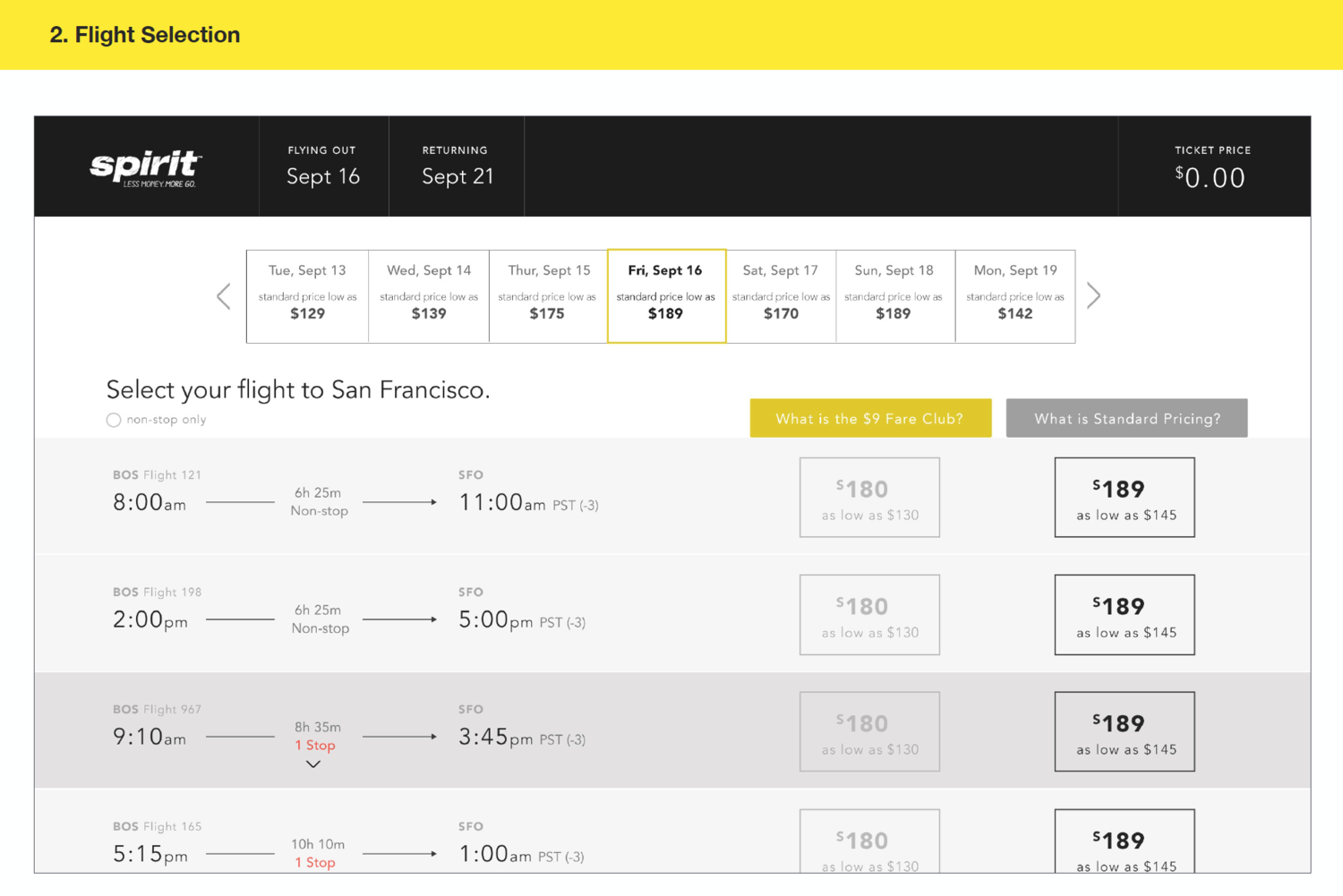
Travelers choose Spirit to save money - period. Therefore, I designed a new approach to the add-on structure. Because research confirmed that users want a complimentary carry-on and seating assignment, I decided to display inclusion pricing for these two add-ons, while allowing customers to save further by opting out of the inclusions (thereby offering bare ethos to those who still want it.)
1.
Booking a flight takes too long and users are abandoning ship midway through the booking process.
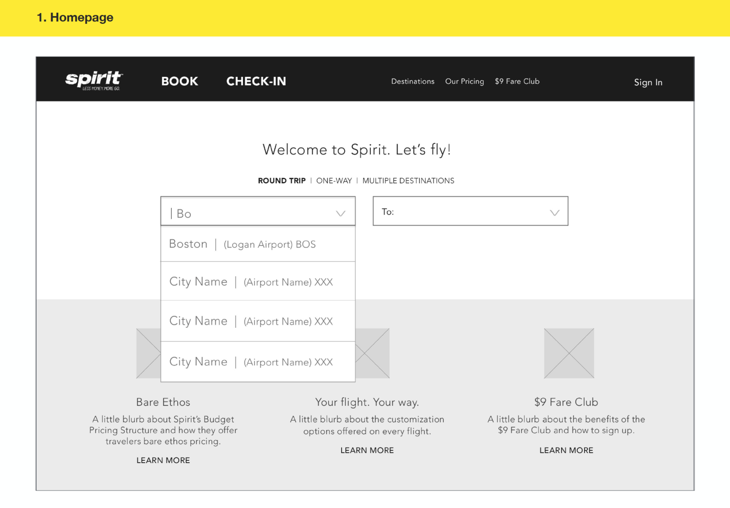
To solve this problem, I proposed a simplified design. I decided to dramatically reduce the number of screens it takes to successfully book a flight from 15 to 6, offer all "add-ons" at once, organize flights by price, request customer information on the final screen and dramatically change the look and feel of the pages. I decided to utilize white space, dropdown navigation elements and simplistic typography to cut down on content.
Spirit's bare ethos remains a part of the user experience, but in a new way.
The new experience displays inclusion pricing (1 carry-on item and a pre assigned seat assignment.) Although ticket prices will be slightly higher, fliers will feel more positively towards the airline, and still have the opportunity to strip down to the "bare fare."

By "opting out" of a carry-on item and pre-assigned seat, fliers can adjust their ticket down to bare bones pricing.

Streamlining the add-on process allowed me to eliminate many unnecessary screens, taking the booking process from 15 screens down to 6.
Prototyping
Because this project was completed in one weeks time in order to apply for Fresh Tilled Soil's AUX program, I did all of my initial wireframing by hand (old school pen & paper) and moved directly into high fidelity prototyping using Photoshop & Invision. Below you can check out some of the low fidelity sketches and the final prototype I presented to earn my spot in AUX 2016 :)

Using a pen and paper is the fastest way to create a simple prototype and eliminate user flow errors before moving into any digital production.
High fidelity designs:


To view complete research results, key insights and final prototype, download the full presentation below.